
料金プランのセクション作っていきましょう。
3つのパートに分けて解説します。
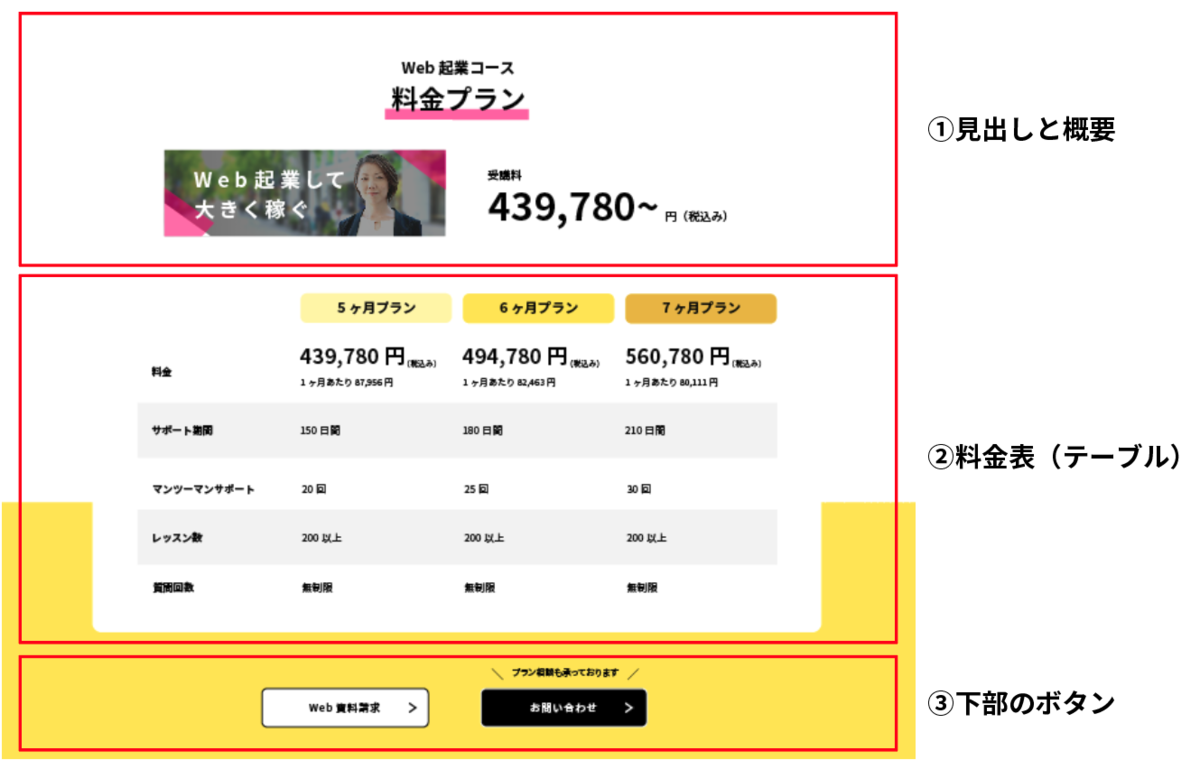
①見出しと概要
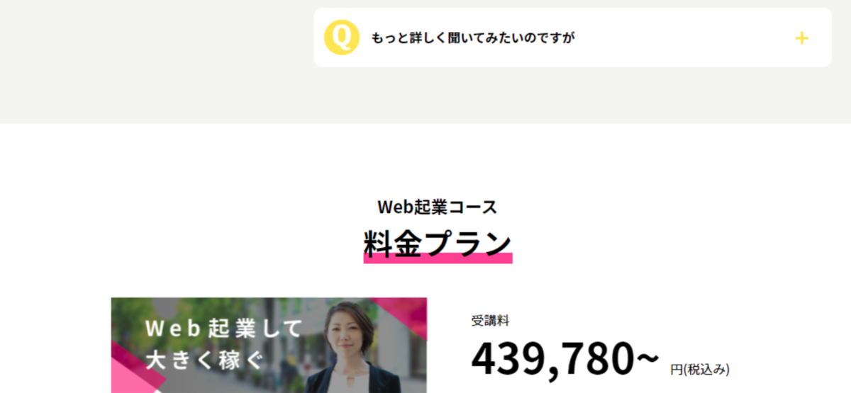
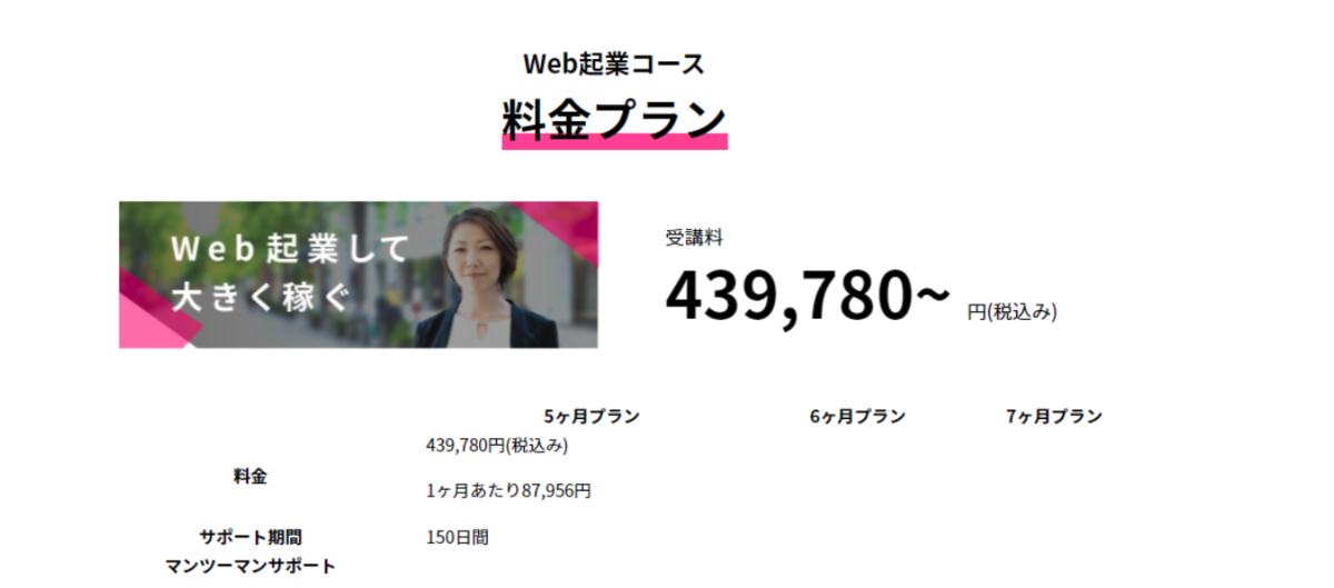
まず、上部の見出しと、料金(最安価格)の部分を作ります。
とりあえず既存のクラスを使って、大まかなレイアウトを作ります。
lp.html
<!-- ============================
/ 料金プラン
/============================= -->
<section class="price mt-5rem">
    <div class="container">
        <h2 class="text-center">
            Web起業コース<br>
            <span class="marker-pink">料金プラン</span>
        </h2>
        <div class="row align-items-center mt-3rem">
            <div class="col-1"></div>
            <div class="col-5">
                <img src="images/plan-image@2x.png" alt="" class="w-max100">
            </div>
            <div class="col-5 fw-bold">
                <p>
                    受講料<br>
                    <span class="fw-bold">439,780~ </span>円(税込み)
                </p>
            </div>
            <div class="col-1"></div>
        </div>
    </div>

</section>
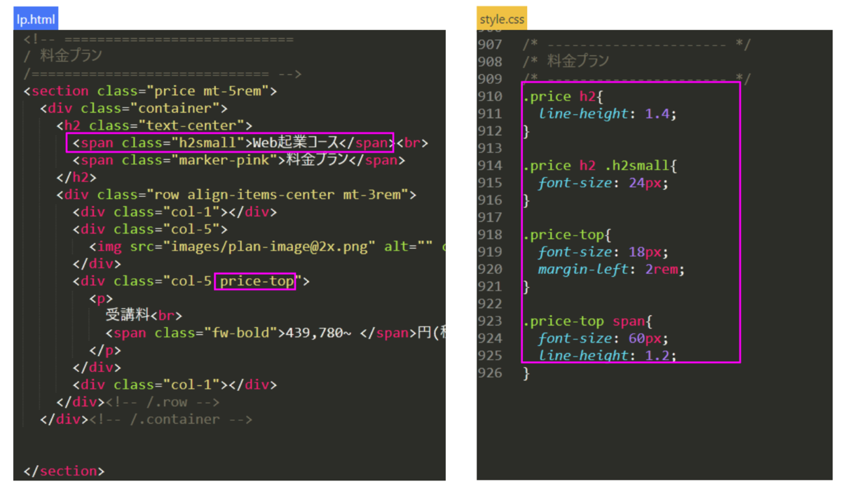
ここから、文字サイズを変更していきます。
スタイル設定用に「h2small」と「price-top」クラスを追加。
style.cssで文字サイズ、行間と余白を設定します。
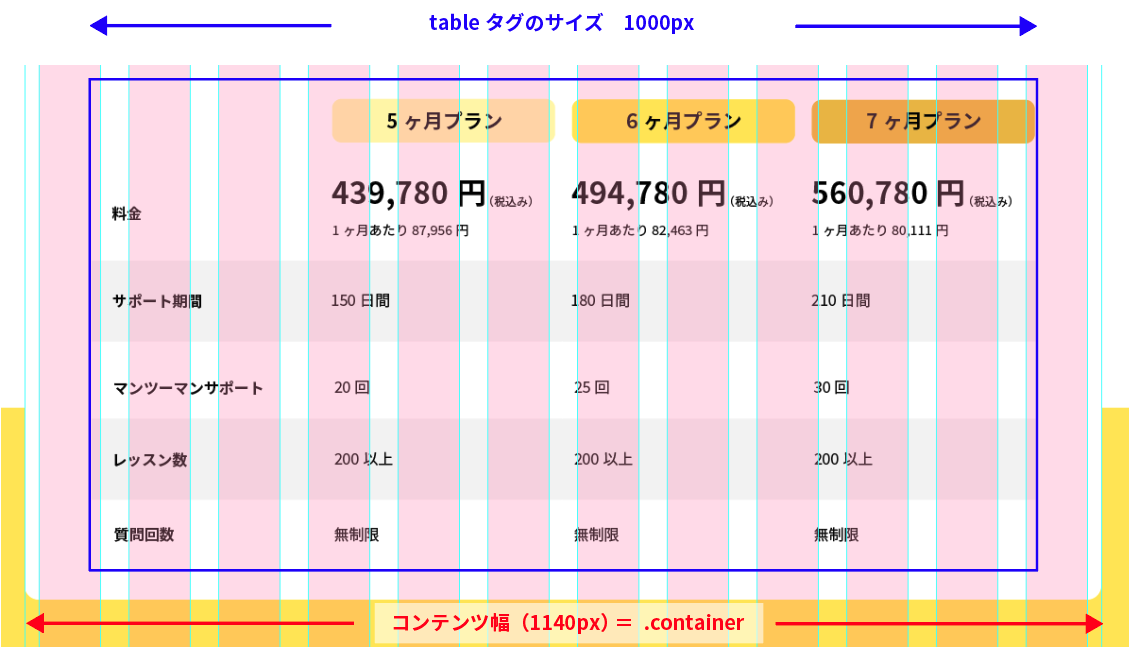
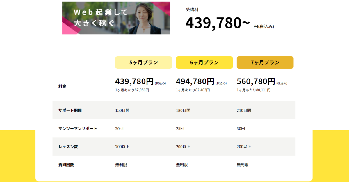
②料金表(テーブル)
1.テーブルの配置と枠組み
料金料部分は<table>タグを使って作っていきます。
最初にテーブルをコンテンツ幅かつ角丸・背景色白の枠で囲っておきましょう。
lp.html
<!-- 料金表 -->
<div class="container bg-white round-border">
    <table class="price-table mx-auto mt-3rem">
    </table>
</div>
style.css
.price-table{
  width: 100%;
  max-width: 1000px;
}
この状態では、まだブラウザに何も表示されません。
<table> ~ </table>の間に、表の中身を入れていきましょう。
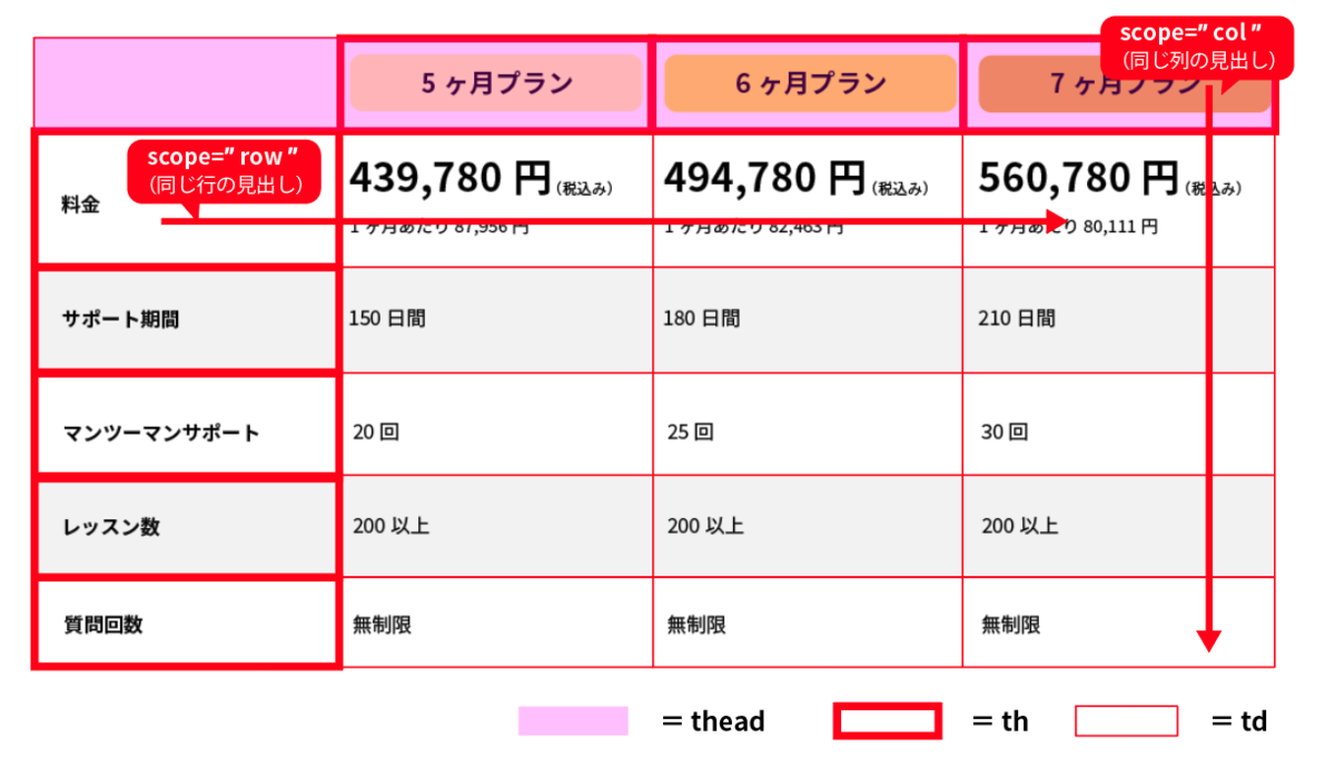
thタグはscope属性を指定すると、どの方向に対して見出しの役割があるかを示すことが出来ます。
最初にすべて情報を入れてしまうと面倒なので、最低限のセルだけテキストを入れて進めます。
(※やりにくい方は情報をすべて入力後、クラスやスタイルを指定しても構いません)
lp.html
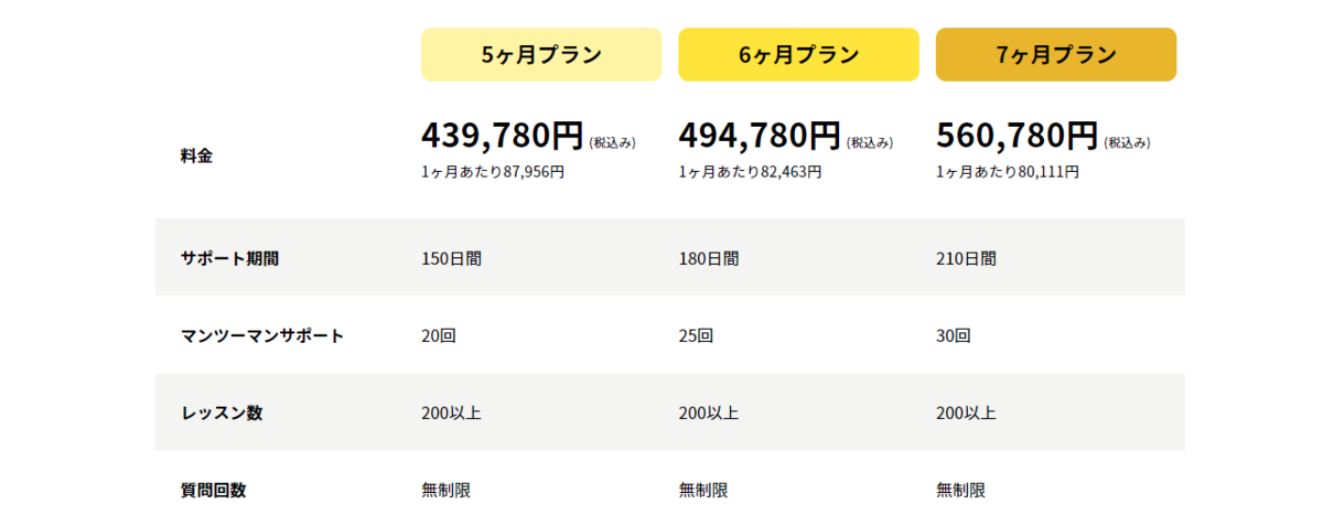
<table class="price-table mx-auto mt-3rem">
    <thead>
        <tr>
            <td></td>
            <th scope="col">5ヶ月プラン</th>
            <th scope="col">6ヶ月プラン</th>
            <th scope="col">7ヶ月プラン</th>
        </tr>
    </thead>
    <tbody>
        <tr>
            <th scope="row">料金</th>
            <td>
                <p class="my-0">439,780円(税込み)</p>
                <p>1ヶ月あたり87,956円</p>
            </td>
            <td></td>
            <td></td>
        </tr>
        <tr>
            <th scope="row">サポート期間</th>
            <td>150日間</td>
            <td></td>
            <td></td>
        </tr>
        <tr>
            <th scope="row">マンツーマンサポート</th>
            <td></td>
            <td></td>
            <td></td>
        </tr>
        <tr>
            <th scope="row"></th>
            <td></td>
            <td></td>
            <td></td>
        </tr>
        <tr>
            <th scope="row"></th>
            <td></td>
            <td></td>
            <td></td>
        </tr>
    </tbody>

</table>
ブラウザで見てみてください。
横並びになっていたり、thタグが太字になっていたりと、tableとして認識されていることがわかります。
上下が近いので、とりあえずすべてのセルに余白を付けておきましょう。
テキストも中央寄せではなく、左寄せに直します。
style.css
.price-table td,
.price-table th{
  padding: 1.6em 0.5em;
  text-align: left;
}
2.thaedの設定
<thaed>で囲っている部分を設定します。
「price-table-plan」クラスを新しく作り、tdとthに指定します。
プランごとに色を変えられるよう、テキスト部分はspanタグで囲って「plan1」「plan2」「plan3」と固有のクラスを加えます。
lp.html
<thead>
    <tr>
        <td class="price-table-plan"></td>
        <th scope="col" class="price-table-plan">
            <span class="plan1">5ヶ月プラン</span>
        </th>
        <th scope="col" class="price-table-plan">
            <span class="plan2">6ヶ月プラン</span>
        </th>
        <th scope="col" class="price-table-plan">
            <span class="plan3">7ヶ月プラン</span>
        </th>
    </tr>
</thead>
style.css
/* thead */
.price-table td.price-table-plan,
.price-table th.price-table-plan{
  margin: 15px;
  padding: 0.5em;
  width: 25%;
}

.price-table-plan span{
  display: inline-block;
  width: 100%;
  padding: 0.5em;
  text-align: center;
  font-size: 21px;
  border-radius: 10px;
}

.price-table-plan .plan1{
  background-color: #FFF39E;
}

.price-table-plan .plan2{
  background-color: #FFE20D;
}

.price-table-plan .plan3{
  background-color: #E8B400;
}
3.料金部分の設定
料金の部分は、文字サイズをそれぞれ変えなくてはいけません。
小さい文字(12pxと14px)は既にクラスがあるので、それを使います。
大きく表示したい金額部分は「pricetext」クラスを新しく作って設定します。
また、文字サイズを変更すると、行間が変わります。
その調節をするために、trタグに「price-table-price」クラスを追加しました。
lp.html
<tbody>
    <tr class="price-table-price">
        <th scope="row">料金</th>
        <td>
            <p class="my-0">
                <span class="pricetext">439,780円 </span>
                <span class="fsize-12"> (税込み)</span>
            </p>
            <p class="fsize-14">1ヶ月あたり87,956円</p>
        </td>
        <td></td>
        <td></td>
    </tr>
    <!-- 以下略 -->
style.css
/* row-料金 */
.price-table-price p{
  line-height: 1;
}

.price-table-price .pricetext{
  font-size: 32px;
  font-weight: bold;
}
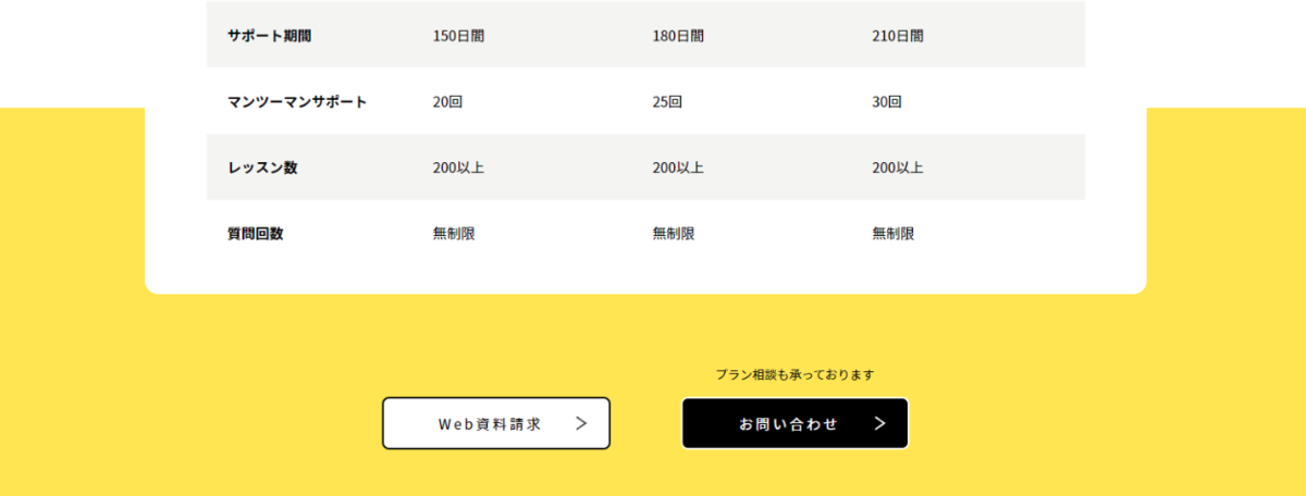
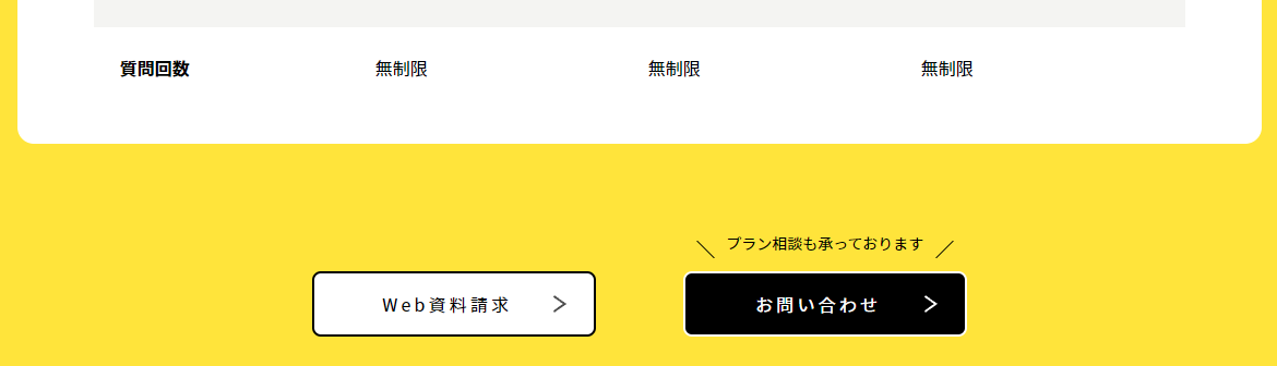
ブラウザで確認して問題なければ、6ヶ月プランと7ヶ月プランのtd内も入れてください。
コピー&ペーストして、必要箇所だけ打ち替えると楽です。
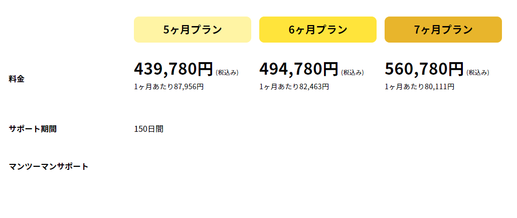
2.色違いtrの設定
サポート期間から下は、文字の大きさが変わったりはしません。
tdタグ内に文字を打ち込んでいけば良さそうです。
1行おきに行の背景色が入っているので、そこだけ設定しましょう。 ①②どちらかの方法で設定してみてください。
① CSSで「tbody内、偶数行のtr」をセレクタに背景色を指定。
style.css
.price-table tbody tr:nth-child(even) {
  background-color: #F4F4F2;
}
② それぞれの tr に背景色を指定するクラスをつける
lp.html
<tr class="bg-lgray">
ブラウザで見てみましょう。
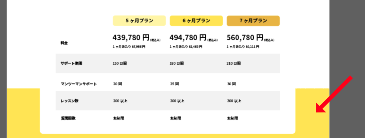
背景色を設定すると、デザインによりも左側に空きが少ないことがわかります。
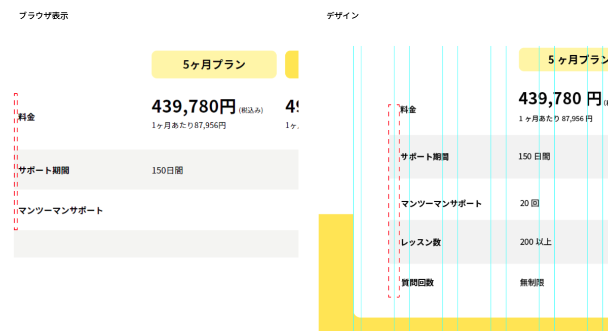
cssで調整しましょう。
style.css
.price-table tbody th{
  padding-left: 1.5em;
}
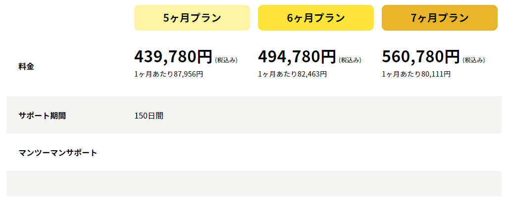
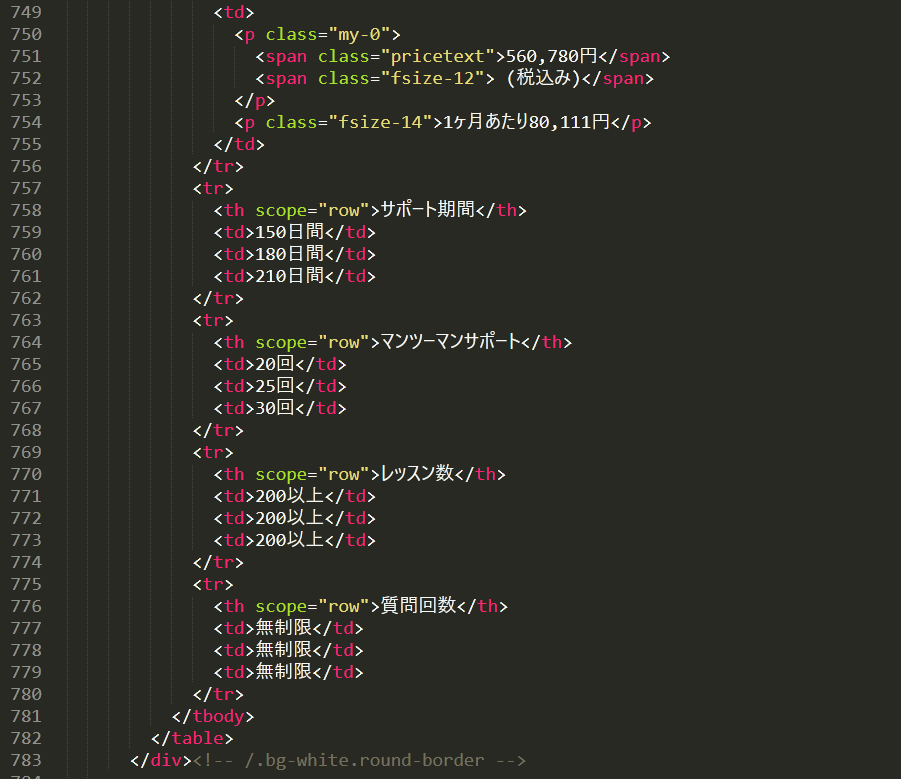
th、tdタグの中身を埋めていきます。
lp.html
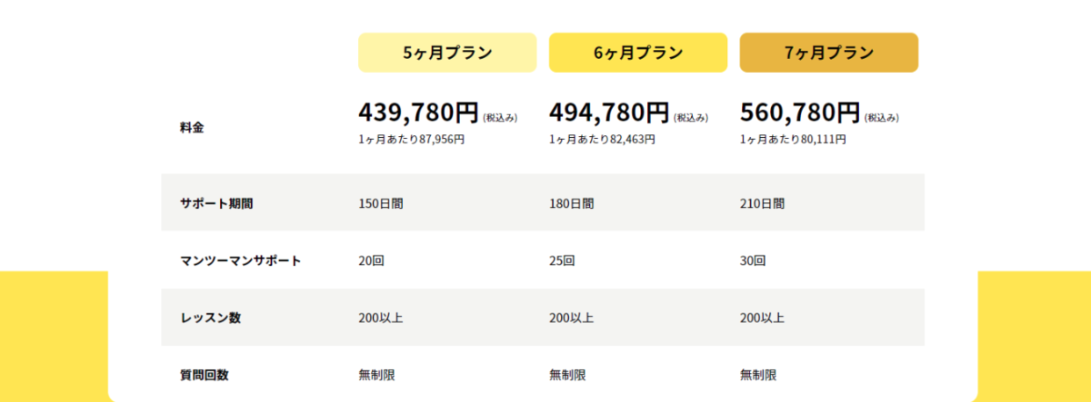
3.黄色の背景色を設定する
料金料(tableタグ部分)の下2行分くらいから入っている、黄色い背景色を設定します。
今は料金表の部分を.containerで囲っているので、そのまま背景を指定しても全幅になりません。
全幅で背景色を設定するために、<div class="container bg-white round-border"> ~ </div>までを囲うdivを新しく作りましょう。
料金表全体を囲うdivには「price-tablewrapper」と「position-relative」クラスを付けます。
lp.html
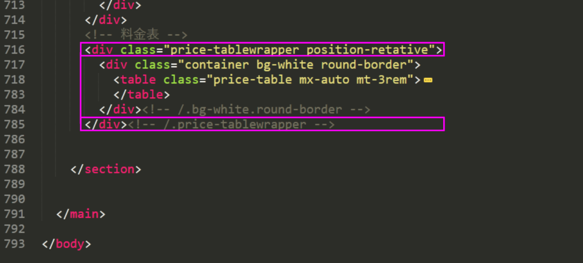
CSSで疑似要素::afterを使って背景を設定します。
「起業を考えた時、こんな課題はありませんか?」の部分と同じ作りです。
style.css
.price-tablewrapper::after{
  position: absolute;
  z-index: -1;
  content: "";
  bottom: 0;
  width: 100%;
  height: 35%;
  background-color: #FFE20D;
}
背景の設定について
見出しのマーカー風装に使っているlinear-gradientで、背景を設定する事もできます。
linear-gradientで作った方が、コード的にはシンプルですね。
.price-tablewrapper{ background: linear-gradient(transparent 65%, #FFE20D 65%); }
レッスンでは要素からズレた位置にある背景色=::afterで設定、と統一しています。が、ご自身で作成される場合はお好きな方法で設定していただいても構いません。
4.余白等の調整
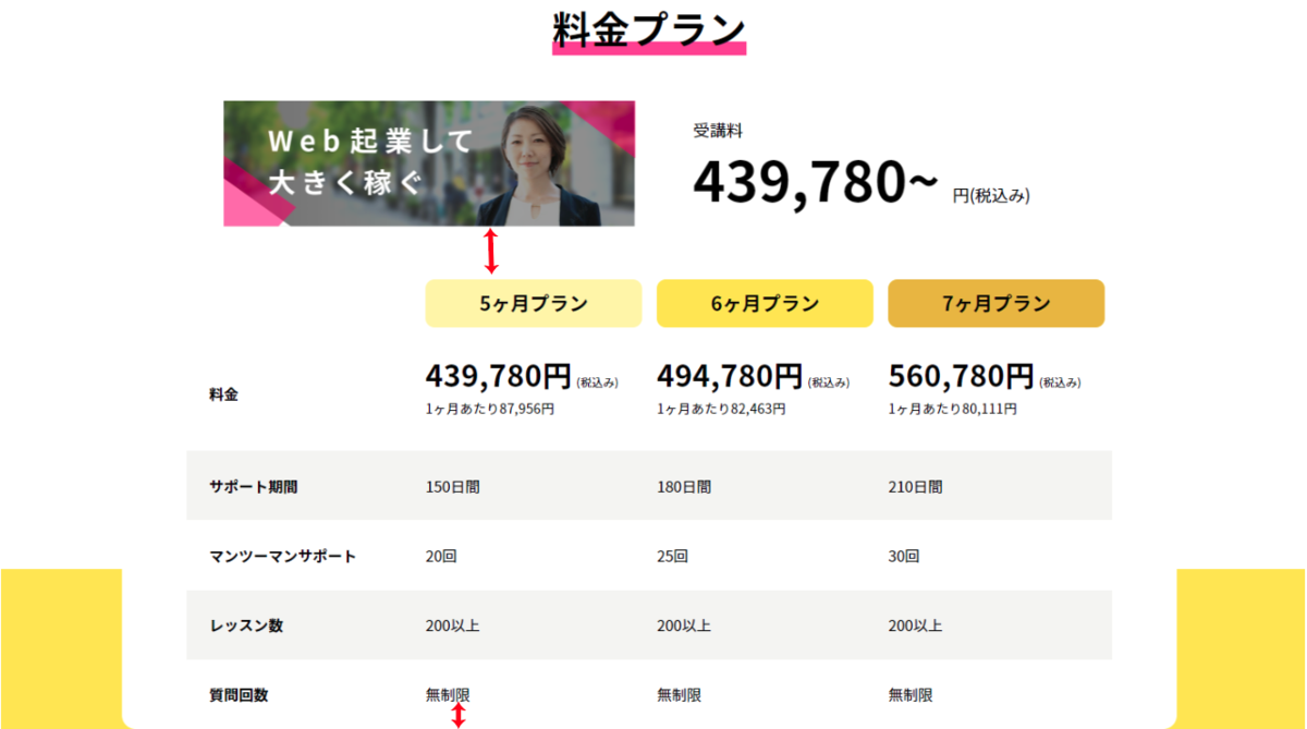
全体を見直してみると、下図で赤い矢印を入れた2箇所がちょっと狭いですね。
もう少し間隔が空くように調整します。
style.css
.price-tablewrapper > .bg-white{
  padding: 2rem 0;
}
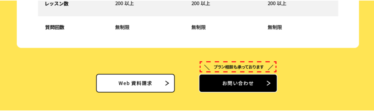
③下部のボタン
ボタン風の「Web資料請求」「お問い合わせ」を作ります。
ほぼCTAと同じですが、お問い合わせの上にテキストが入っている点が違います。
1.使える部分をコピーする
CTA部分のコードをコピー&ペーストし、今回の料金表下部分では要らない部分を削除していきます。
変更点は下記の6点。
- sectionタグをdivタグに変更
- h2見出しを削除
- h2の配置のために設定したposition-relativeクラスを削除
- pタグを削除
- containerのdiv,その閉じタグを削除
- インデントを整える
lp.html
<div class="cta bg-yellow">
    <div class="cta-btns">
        <div class="btn bg-white">
            <span class="col text-center">Web資料請求</span>
            <img src="images/btn-chevron.svg" alt="">
        </div>
        <div class="btn bg-black text-white">
            <span class="col text-center">お問い合わせ</span>
            <img src="images/btn-chevron-white.svg" alt="">
        </div>
    </div><!-- /.cta-btns -->
</div><!-- /.cta -->
2.テキストを追加
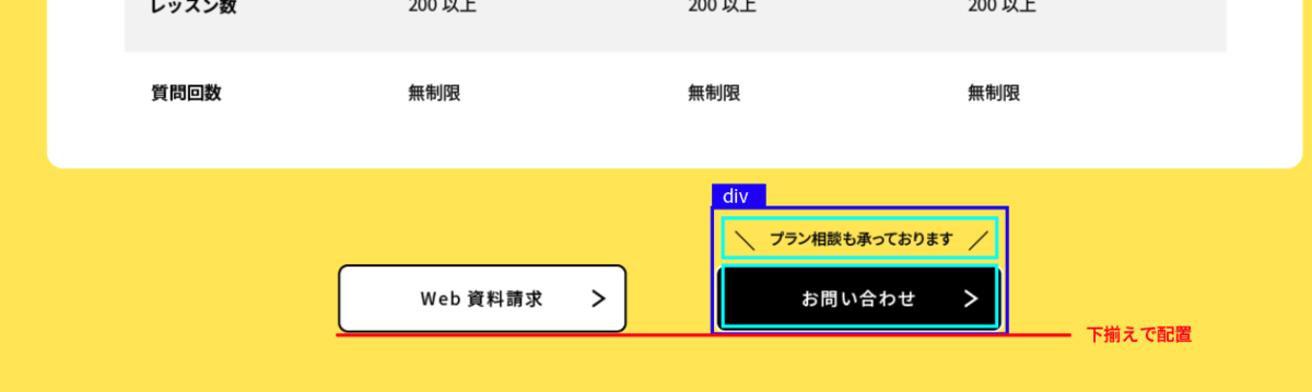
お問い合わせの方をdivタグで囲います。
その中にfont-size:14pxで「プラン相談も承っております」のテキストを入力。
下揃えに配置できるようcta-btnsクラスを持つdivタグには、align-items-endクラスを追加しましょう。
lp.html
<div class="cta bg-yellow">
    <div class="cta-btns align-items-end">
        <div class="btn bg-white">
            <span class="col text-center">Web資料請求</span>
            <img src="images/btn-chevron.svg" alt="">
        </div>
        <div>
            <p class="fsize-14 text-center mt-0">
                プラン相談も承っております
            </p>
            <div class="btn bg-black text-white">
                <span class="col text-center">お問い合わせ</span>
                <img src="images/btn-chevron-white.svg" alt="">
            </div>
        </div>
    </div><!-- /.cta-btns -->
</div><!-- /.cta -->
【ブラウザ表示】
3.テキスト装飾
「プラン相談も承っております」の左右にある、線の吹き出し部分を作ります。
疑似要素で作成出来るように、pタグにはposition-relativeクラスを加えておいてください。
CSSの方で、左右の線を作っていきます。
作り方は、よくある質問で作った×マークとほぼ同じ。
同じ位置に重ねて表示すると×、左右に配置すると\ /になります。
style.css
/* cta */
.price .cta-btns p::before,
.price .cta-btns p::after{
  position: absolute;
  content:'';
  width: 1px;
  height: 22px;
  background-color: #000000;
}

.price .cta-btns p::before{
  top: 25%;
  left: 20px;
  transform: rotate(-45deg);
}

.price .cta-btns p::after{
  top: 25%;
  right: 20px;
  transform: rotate(45deg);
}
料金料パート、完成です。