
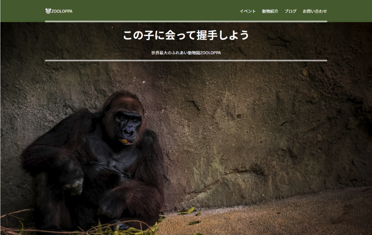
PC幅レイアウトでのファーストビューを作ります。
ファーストビュー
1.スペース確保と背景画像設定
全体を囲うsectionタグ、テキスト等を入れるdiv.containerを挿入。
sectionタグにはクラスを設定し、背景画像を指定します。
html
<main>
     <!-- ============================
    / first view
    /============================= -->
    <section class="fv">
        <div class="container">

        </div><!-- /.container -->
    </section>

</main>
css
/* ---------------------- */
/* first view
/* ---------------------- */
.fv {
background-image: url('images/gorilla.jpg');
background-size: cover;
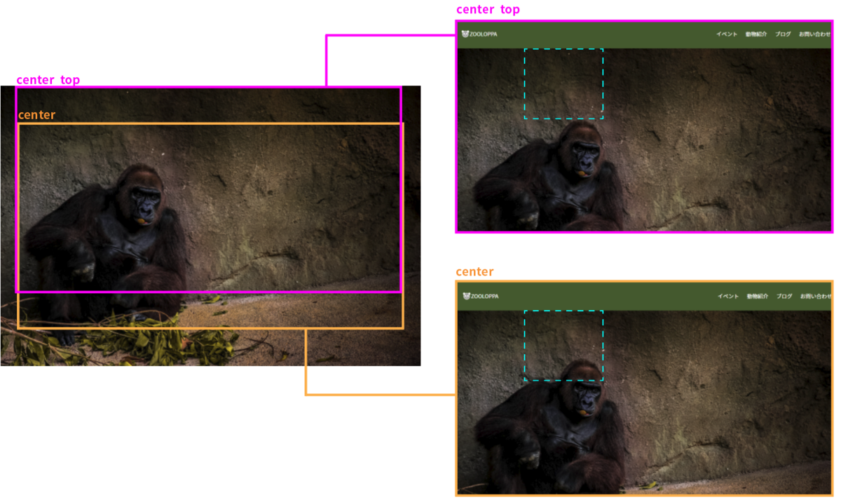
background-position: center top;
width: 100%;
height: 100vh;
}
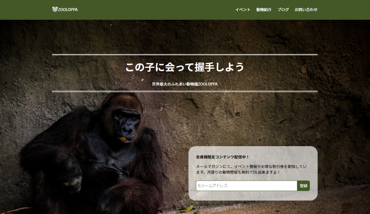
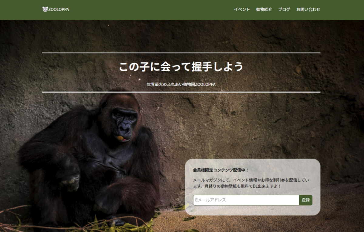
上部には「この子に会って握手しよう」などの文字が表示される予定です。
このため背景画像の位置を「center top」に指定し、被る範囲を減らすようにしています。
ビューポート基準の単位vhとvwにはちょっと落とし穴があります。
ブラウザウィンドウのサイズのうち何%、という指定になるので、閲覧環境によってはレイアウトが変になってしまう場合があるのです。
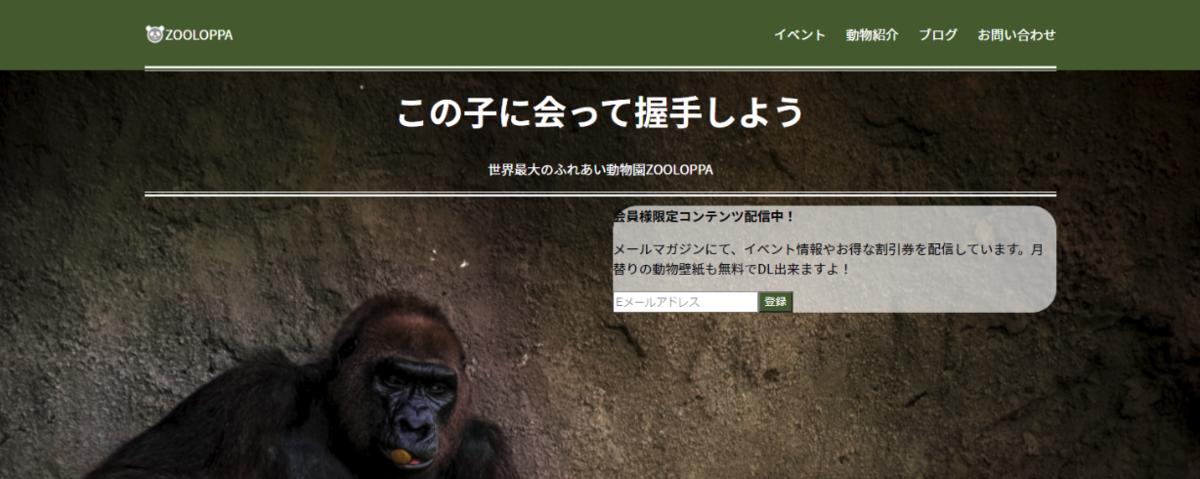
例えば、検証ツールで表示領域を狭めると下図のようになります。
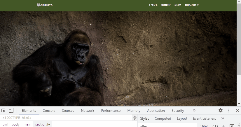
これしか高さがないと、メール登録のフォームがはみ出してしまいそうですね。
反対に、大きなモニターでページを見ている方もいらっしゃるかもしれません。
念の為に、最小と最大の高さも合わせて指定しておきましょう。
css
.fv {
  background-image: url('images/gorilla.jpg');
  background-size: cover;
  background-position: center top;
  width: 100%;
  height: 100vh;
  min-height: 600px;
  max-height: 1200px;
}
全画面表示に関して
今回はしていませんが、最初に表示される領域ピッタリにファーストビューの高さを指定したい時はcalc( 100vh - ヘッダーの高さpx )のように書くとできます。
2.タイトルテキスト
二重線で囲まれたテキスト部分を作成します。
何通りか作り方はありますが、解説ではテキスト部分を囲うdiv+疑似要素で作ります。
テキスト部分を囲うdivにはCSS設定用に「topcopy」クラスを加えています。
html
<section class="fv">
    <div class="container">
        <div class="topcopy text-center text-white position-relative">
            <h1>
                この子に会って握手しよう
            </h1>
            <p>
                世界最大のふれあい動物園ZOOLOPPA
            </p>
        </div><!-- /.topcopy -->

    </div><!-- /.container -->
</section>
CSSで、線の設定をしていきましょう。
- .topcopyで、内側の細い線(1px)を作る
- 疑似要素のbeforeとafterで、外側の太い線(3px)を作る
- 見出し(h1)のフォントサイズと上マージンを指定する
css
.topcopy{
  border-top: 1px solid #EEEEEE;
  border-bottom: 1px solid #EEEEEE;
}

.topcopy::before,
.topcopy::after{
  content: "";
  position: absolute;
  left: 0;
  width: 100%;
  height: 3px;
  background: #EEEEEE;
}

.topcopy::before{
  top: -6px;
}

.topcopy::after{
  bottom: -6px;
}

/* --- 見出し --- */
h1{
  font-size: 42px;
  margin-top: 1rem;
}
位置に関しては、次のメール登録のパーツと合わせて最後に調整します。
3.メール登録部分
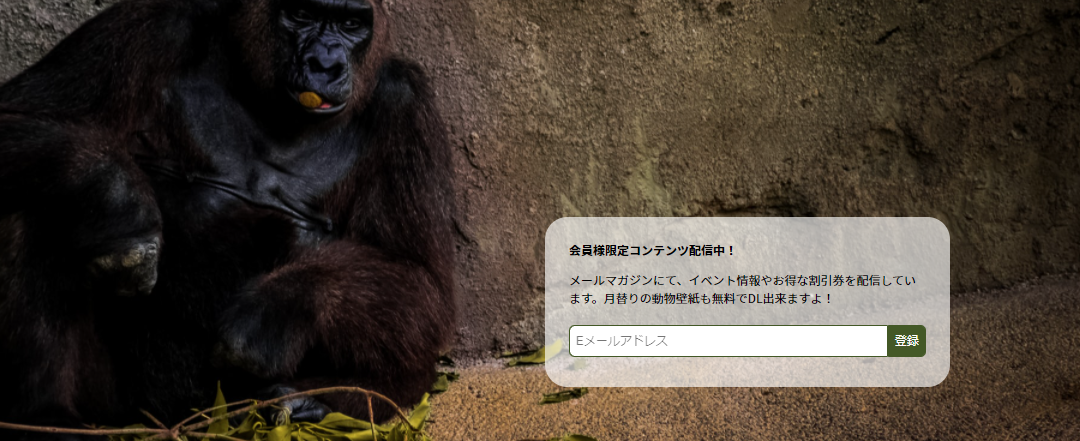
まずはHTMLで必要な要素を書いていきましょう。
html
<div class="row justify-content-end">
    <div class="col-6">
        <div class="fv-form b-radius30">
            <p class="fw-bold">
                会員様限定コンテンツ配信中!
            </p>
            <p>
                メールマガジンにて、イベント情報やお得な割引券を配信しています。月替りの動物壁紙も無料でDL出来ますよ!
            </p>
            <form class="d-flex">
                <input type="email" id="email" name="mail" placeholder="Eメールアドレス">
                <button type="submit" class="bg-dgreen text-white">
                    登録
                </button>
            </form>
        </div><!-- /.fv-form -->
    </div><!-- /.col-6 -->
</div><!-- /.row -->
角を丸くするスタイルは、同ページ内で多く使われています。
他でも使えるように「b-radius30」クラスを作りました。
背景色など角丸以外の設定は「fv-form」クラスを使う形です。
css
/*  --- ページ共通クラス ---  */
.b-radius30{
  border-radius: 30px;
}

/*  --- fvのフォーム ---  */
.fv-form {
  background: rgba(255, 255, 255, 0.65);
}
枠は出来ました。
fv-formにpaddingを加えて、その中身の方も表示を整えましょう。
css
.fv-form {
  padding: 1rem 2rem;
  background: rgba(255, 255, 255, 0.65);
}

.fv-form form{
  margin: 1.5em auto;
}

.fv-form input,
.fv-form button{
  font-size: 1rem;
  padding: 0.5em;
  border: 1px solid #445721;
}

.fv-form input{
  flex: 1;
  max-width: calc(100% - 3.25em); /* 全体 - buttonの幅分 */
  border-radius: 8px 0 0 8px;
}

.fv-form button{
  width: 3.25em; /* 2文字 + 左右余白 + 余裕をもたせる(.25rem) */
  background: #445721;
  border-radius: 0 8px 8px 0;
  cursor: pointer;
}
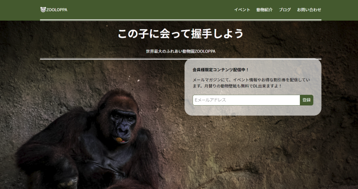
4.位置を整える
ファーストビューの高さは、表示画面の大きさに合わせて変わります。
margin-top: 200px;など大きな固定値を使うと、閲覧環境によってはみ出してしまう可能性があります。
flexを使って配置しましょう。
containerクラスのdivに「d-flex」クラスを追加してflexコンテナ化します。
更に「fv-inner」クラスを新しく作成し、配置に必要なスタイルを書きます。
html
<section class="fv">
    <div class="container d-flex fv-inner"><!--  クラス追加 -->

        <!--  ~~以下略~~  -->
css
.fv-inner{
  flex-direction: column;
  justify-content: space-around;
  height: 100%;
}
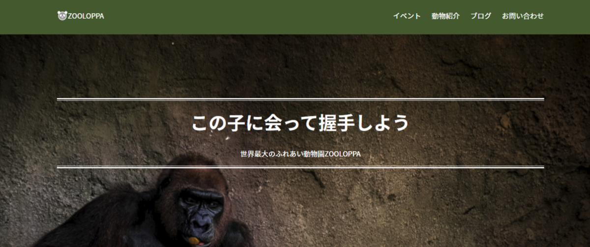
.fvにpaddingを加えて微調整すれば完成です。
css
.fv {
  background-image: url('images/gorilla.jpg');
  background-size: cover;
  background-position: center top;
  width: 100%;
  height: 100vh;
  min-height: 600px;
  max-height: 1200px;
  padding: 2rem 0; /* 今回追加部分 */
}