
初期設定
新規ファイルを作成したら、実習で作ったファイルから使える部分を貼り付けて初期設定をしましょう。
解説ではファイル名をlpkadai.html、lpkadai.cssとしています。
HTML
html
<!DOCTYPE html>
<html lang="ja">
<head>
  <meta charset="UTF-8">
  <meta name="viewport" content="width=device-width, initial-scale=1.0">
  <title>LP課題-ZOOLOPPA</title>
  <!-- sanitize -->
  <link href="https://unpkg.com/sanitize.css" rel="stylesheet"/>
  <!-- google fonts & icon -->
  <link rel="preconnect" href="https://fonts.googleapis.com">
  <link rel="preconnect" href="https://fonts.gstatic.com" crossorigin>
  <link href="https://fonts.googleapis.com/css2?family=Noto+Sans+JP:wght@400;700&display=swap" rel="stylesheet">
  <link href="https://fonts.googleapis.com/icon?family=Material+Icons+Outlined" rel="stylesheet">
  <!-- original -->
  <link rel="stylesheet" type="text/css" href="kadai.css" media="all" />
</head>
<body>
  <header></header>
    <main></maiin>
  <footer></footer>
</body>
CSS
CSSも、使えるところは実習のファイルからコピペしていきます。
col-*クラスは使わないところもありますが、12個の設定はセットのようなものなので丸ごとコピペしてしまいましょう。
もちろん使う部分だけピックアップしても良いです。
css
@charset "utf-8";
/* ============================================== */
/* base setting
/* ============================================== */
body {
  font-family: 'Noto Sans JP', sans-serif;
}

a {
  color: inherit;
  text-decoration: none;
}

/* ---------------------- */
/* container & 12grid
/* ---------------------- */
.container {
  max-width: 1140px;
  margin-right: auto;
  margin-left: auto;
  padding-left: 15px;
  padding-right: 15px;
}

.row {
  display: flex;
  flex-wrap: wrap;
  margin-left: -15px;
  margin-right: -15px;
}

/* col系クラス共通 */
.col,
.col-1,
.col-2,
.col-3,
.col-4,
.col-5,
.col-6,
.col-7,
.col-8,
.col-9,
.col-10,
.col-11,
.col-12 {
  padding-right: 15px;
  padding-left: 15px;
}

.col {
  flex: 1;
}

.col-1 {
  flex: 0 0 auto;
  width: calc(100% / 12);
}

.col-2 {
  flex: 0 0 auto;
  width: calc(100% / 12 * 2);
}

.col-3 {
  flex: 0 0 auto;
  width: calc(100% / 12 * 3);
}

.col-4 {
  flex: 0 0 auto;
  width: calc(100% / 12 * 4);
}

.col-5 {
  flex: 0 0 auto;
  width: calc(100% / 12 * 5);
}

.col-6 {
  flex: 0 0 auto;
  width: calc(100% / 12 * 6);
}

.col-7 {
  flex: 0 0 auto;
  width: calc(100% / 12 * 7);
}

.col-8 {
  flex: 0 0 auto;
  width: calc(100% / 12 * 8);
}

.col-9 {
  flex: 0 0 auto;
  width: calc(100% / 12 * 9);
}

.col-10 {
  flex: 0 0 auto;
  width: calc(100% / 12 * 10);
}

.col-11 {
  flex: 0 0 auto;
  width: calc(100% / 12 * 11);
}

.col-12 {
  flex: 0 0 auto;
  width: calc(100%);
}

/* ---------------------- */
/* flexlayout
/* ---------------------- */
.d-flex {
  display: flex;
  flex-wrap: wrap;
}

.align-items-center {
  align-items: center;
}

.justify-content-end {
  justify-content: flex-end;
}

/* ---------------------- */
/* text & color
/* ---------------------- */
.fw-bold{
  font-weight: 600;
}

.text-center {
  text-align: center;
}

.text-white{
  color: #FFFFFF;
}

/* ---------------------- */
/* others
/* ---------------------- */
.position-relative {
  position: relative;
}

.position-absolute {
  position: absolute;
}

.w-max100 {
  max-width: 100%;
  height: auto;
}
ヘッダー&フッター作成
1.配色の設定
ヘッダー部分を作っていきます。
今回の課題は背景色 ■ #445721が何箇所か使われているので、背景色設定用のクラスも作っておきます。
css
.bg-dgreen{
  background: #445721;
}
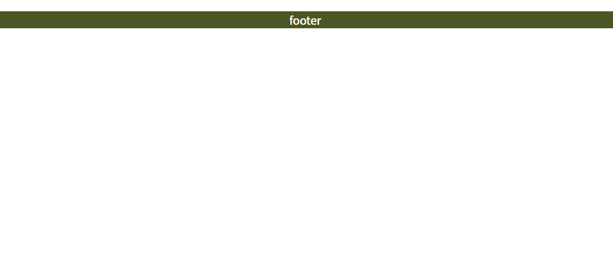
header,footer要素全体に、文字色と背景色を指定するクラスを加えます。
footerはテキストだけなので、一緒に書いてしまいましょう。
html
<body>
  <header class="text-white bg-dgreen">

  </header>

  <main></main>

  <footer class="text-white bg-dgreen">
    <p class="text-center">footer</p>
  </footer>
</body>
CSSが効いていればOKです。
2.ヘッダー内(ナビゲーション)
ヘッダーナビゲーションを作ります。
作り方のイメージは下図です。
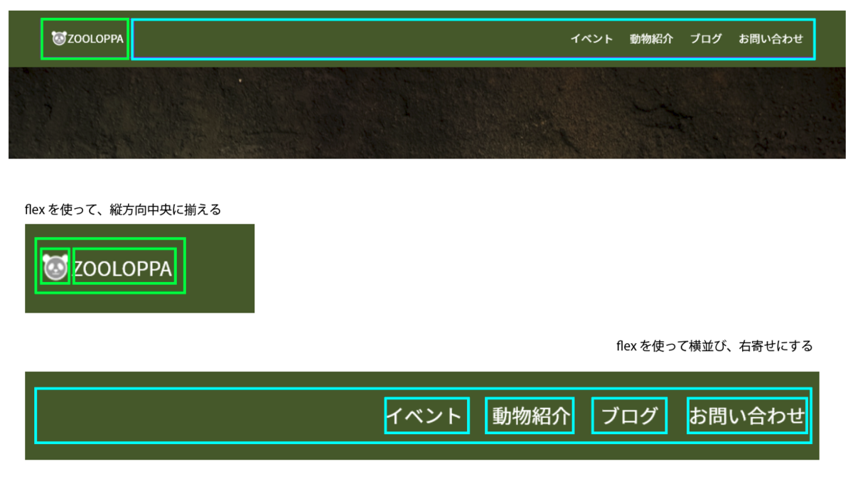
htmlで書くと下記のようになります。
html
<header class="text-white bg-dgreen">
    <div class="container">
        <div class="row align-items-center">
            <div class="d-flex align-items-center">
                <img src="images/logo.png" width="25" height="25" alt="ZOOLOPPA">
                <p>ZOOLOPPA</p>
            </div>
            <nav class="col">
                <ul class="d-flex justify-content-end">
                    <li><a href="#">イベント</a></li>
                    <li><a href="#">動物紹介</a></li>
                    <li><a href="#">ブログ</a></li>
                    <li><a href="#">お問い合わせ</a></li>
                </ul>
            </nav>
        </div>
    </div>
</header>
ブラウザで見てみると、大まかな配置は出来ています。
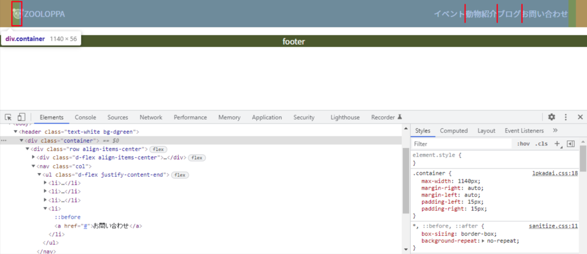
ロゴの部分がcol系のクラスで囲っていないので、15px外側にズレています。
新しくheader-logoクラスを作って、CSSで調整しましょう。
html
<div class="header-logo d-flex align-items-center">
    <img src="images/logo.png" width="25" height="25" alt="ZOOLOPPA">
    <p>ZOOLOPPA</p>
</div>
.header-logoのpadding、li要素間にも間隔を加えます。
css
.header-logo{
  padding: 0 15px;
}

header nav li{
  margin-left: 1.5rem;
}
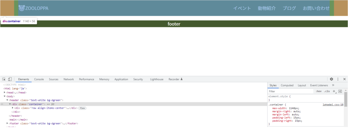
3.上下paddingを追加
headerとfooter、どちらも見本と比べるとまで細いです。
上下のpaddingを加えて、同じくらいの太さにします。
css
header {
  padding-top: 1rem;
  padding-bottom: 1rem;
}

footer{
  padding-top: 5rem;
  padding-bottom: 3rem;
}
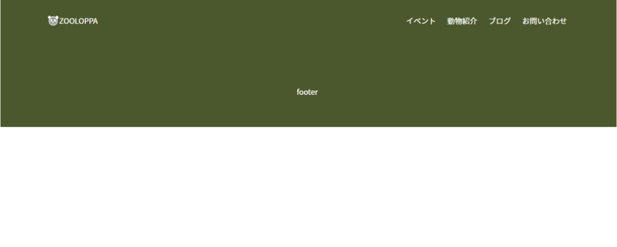
これで、headerとfooter完成です。
余白(padding)などは後でも調整できますので、悩んだ時は大まかに値を設定しておいても良いと思います。